 |
 |
Article by E.C.McMullen Jr. March, 5, 2015 |
||
Mutant Enemy, AFX Studios, Metro-Goldwyn-Mayer (MGM), United Artists, Lionsgate Rated: USA: R |
||||
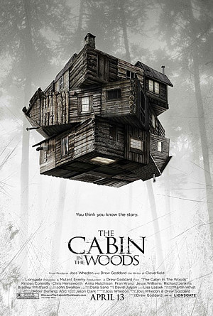
You see that THE CABIN IN THE WOODS poster up there? That is one brilliant poster, my friend, and I'll tell you why. That poster tells you that the movie you are about to watch is going to be far from an ordinary Cabin in the Woods picture.
Ignition Creative designed that poster and, to their credit, Lionsgate recognized its genius. Whoever came up with that original poster idea was onto something, because they recognized the value and the soul of the movie itself. They got it! They understood where the wildness was going and they were wholly onboard with it!
Unfortunately there were other voices as well. Those who wanted a mediocre poster so hideous by comparison that ...
But wait!
I'm getting ahead of myself.
I should say a little about the movie first.
Sometimes lightning is captured in a bottle and a movie is inspirational and influential.
THE CABIN IN THE WOODS was neither of these, but then, that wasn't what writers Joss Whedon and Drew Goddard were going for. As is typical of their careers, they were out to smash old Horror movie devices, defaults, stereotypes, and any and all other effluvia that craps up quality film making.
They weren't after this one thing or other, they were out to harvest a field!
Since they are out to do that anyway, why not make it refreshingly fun instead of tediously preachy?
That's what THE CABIN IN THE WOODS was. It has an enjoyable elan that neither mocks itself or takes itself seriously. Which makes it attain that rarified air of Cool.
Unfortunately there is usually a disconnect between a film maker and the studio or distributor marketing team. Those in the marketing department may be young, but they are enmeshed in the hoary old teachings of their hoary old teachers back at the hoary old U, who beat their creativity into submission and plugged them into "The Way It's Always Done" ethos.
The problem with The Way It's Always Done is it never matters if that "Way" works or not, is successful or not, or if it's so old that people openly mock it. Why?
Because that's The Way It's Always Done.
For those of you who have seen THE CABIN IN THE WOODS and realize its antithesis nature to all Horror Thriller movie standards that have come before, check out the following movie posters brought to you by people who don't get the movie, "Oh! But it has young nobody actors! We'll put them up there to draw in the crowd! You know, like they did in the 2000s and 1990s before that."
Because that's the way it's always done!
You'll want to think that Lionsgate was being as ironic as THE CABIN IN THE WOODS itself. But they'll hammer you into submission.
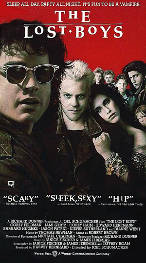
For example, In 1987, Caryn James of the New York Times, called THE LOST BOYS (among other things in his review), "HIP". Ron Base of Toronto Star (somewhere in his review) called it "SCARY".
THE LOST BOYS poster had their whole cast of nobodies on there, sure, but the arrangement gave it a weird, threatening appeal. There is little to nothing in the image that looks like mere Drag and Drop assembly line work. The actors are all in character and the facial expressions (and goofy sunglasses) of Jason Patric, Kiefer Sutherland, and Jami Gertz reveal that. Kiefer is clearly the bad-ass and Jami is obviously the damsel in distress.
Whenever you have your actor's faces on your poster, you're supposed to do that to get people enthused about your movie. Back in the 1980s, this was long established and well known.
Hip and Scary!
THE LOST BOYS image you are looking at there is the Video cover. Warner Bros. wisely kept the original movie poster and added the blurbs. Not a bad move at all, but from then on it seems, marketers were in search of movie reviews that contained the word "Hip" or "Scary" in their content. Or maybe "Hip And Scary". By the 1990s, the new crop of marketers forgot what the actors were on the poster for.
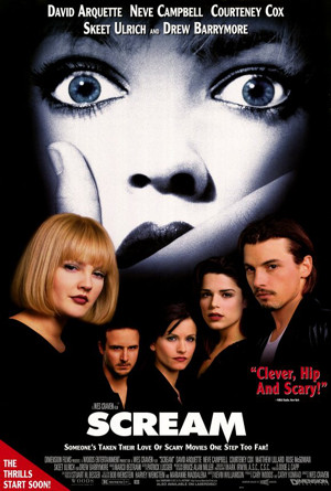
In 1996, WBAI Radio, New York called SCREAM,
"HIP AND SCARY!"
With Wes Craven's SCREAM, it happened. The actors are all out of character and don't seem particularly pleased about having to deal with the photoshoot. Drew Barrymore looks either bored or halfway through a blink when the photographer took her photo. Fortunately the movie was made by Wes Craven who had a cache of goodwill from his past Horror Thriller catalog and audiences gave it a chance.
If you are a Wes Craven or Robert Rodriguez, fresh off a string of hits, your movie can survive a mediocre poster.
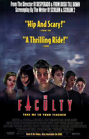
In 1998, FOX-TV called THE FACULTY,
"HIP AND SCARY!"
It's the same thing with THE FACULTY. Out of character, side-eyed, and bored expressions.
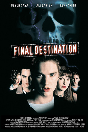
If they didn't add a photo of a plastic skull,
this poster would be meaningless.
If you're not a Craven or Rodriguez, you'd better have a hot, preferably known for Horror, actor for your foreground face (not that you need one, but if you are going to do it...). With 2000's FINAL DESTINATION, Devon Sawa was coming off of his surprise 1999 hit, IDLE HANDS, so he gets face time. But Sawa, Ali Larter, and Kerr Smith all look bored or put upon. Devon is both dull-eyed and Slack-jawed. What the hell were they going for with that?
TRIVIA May 2021 UPDATE: *The late John Alvin also created the movie posters for YOUNG FRANKENSTEIN, PHANTOM OF THE PARADISE, BLADE RUNNER, GREMLINS, and POLTERGIEST to name a few. |
Nobody is misunderstanding me, right? I'm not slamming these movies. In fact, I love all of these movies.
I'm also not slamming the movie critics. They don't know if their reviews will be used or how. More than a few reviewers have trashed a movie saying to the effect, "This was a slow roller-coaster ride through shit." only to see their name on the movie poster enthusiastically blurb, "Roller-Coaster Ride!"
The point I'm talking about is marketing distributors ordering poster makers to trot out another plate of garbage because they have no clue that a poster loaded with out of character young nobodies that no one (up to that point) has heard of, will not sell people on the movie. These marketers may have teachers that reference posters like THE LOST BOYS, but neither their teacher or these n00b graduates understand what Warner Bros., Poster artist John Alvin* and Intralink Film Graphic Design were doing when they made it.
In fact, let's look at a few posters to Horror Thriller movies that have not only endured for decades, but remain influential to this day.
| 1 | 2 | 3 | |
This article copyright 2015 E.C.McMullen Jr.
RESOURCES include IMPAwards and WrongSideOfTheArt (Deceased)

|
| DRESS NICE | |
| YOU MIGHT ALSO LIKE THESE | ||
 |
 |
 |
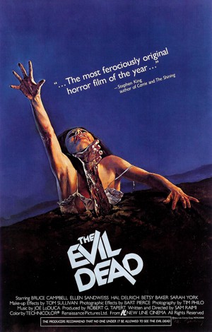
| THE EVIL DEAD MOVIE REVIEW |
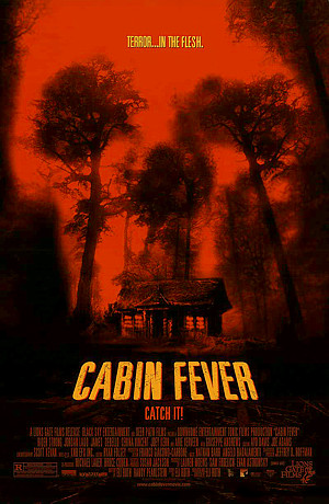
CABIN FEVER MOVIE REVIEW |
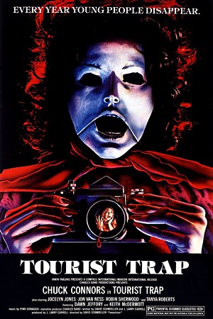
TOURIST TRAP MOVIE REVIEW |
| FEO AMANTE'S HORROR THRILLER Created by: E.C.MULLEN JR. |
| COME FOLLOW ME @ Amazon |
| ECMJr |
| Feo Blog |
| IMDb |
| Stage32 |
| YouTube |
| Zazzle Shop |
